
Charles Stanley
Bringing digital to the core
Charles Stanley is one of the UK's oldest wealth management firms. I joined as Design Director to help transform its digital experience, leading the design of a new logged-in platform, website and scalable design system.
Working across research, service design and product design, I helped turn complex investment journeys into simpler, more intuitive experiences while creating the foundations for a more modern digital service.
The challenge
Charles Stanley was transforming from a traditional wealth management business into a more modern, digitally enabled service. But years of growth had created fragmented customer journeys, inconsistent experiences and technology that made change difficult.
We started by understanding the end-to-end experience, mapping key journeys and identifying where digital could remove friction or create new value. This gave the organisation a shared view of the experience and helped us prioritise where design could have the greatest impact.


Crafting a new digital identity
Alongside the product transformation, I led the evolution of Charles Stanley’s digital identity, creating a visual language that felt contemporary while retaining the trust and heritage of the brand.
Typography: We introduced a distinctive serif typeface to bring character and confidence to the digital experience.
Colour palette: We expanded the existing palette, creating greater flexibility across digital products.
The Kaleidoscope: I reimagined this cherished graphical device as a suite of flexible, personality-driven elements. I even named two “Charles” and “Stanley”, making content creation within the CMS more engaging and fun for the client.


Website → A more confident digital presence
A strong identity adapts according to the job at hand. The website features vibrant, story-driven layouts that convey confidence, prestige, and warmth, standing out in a competitive market.

Account area → Rethinking the investor experience
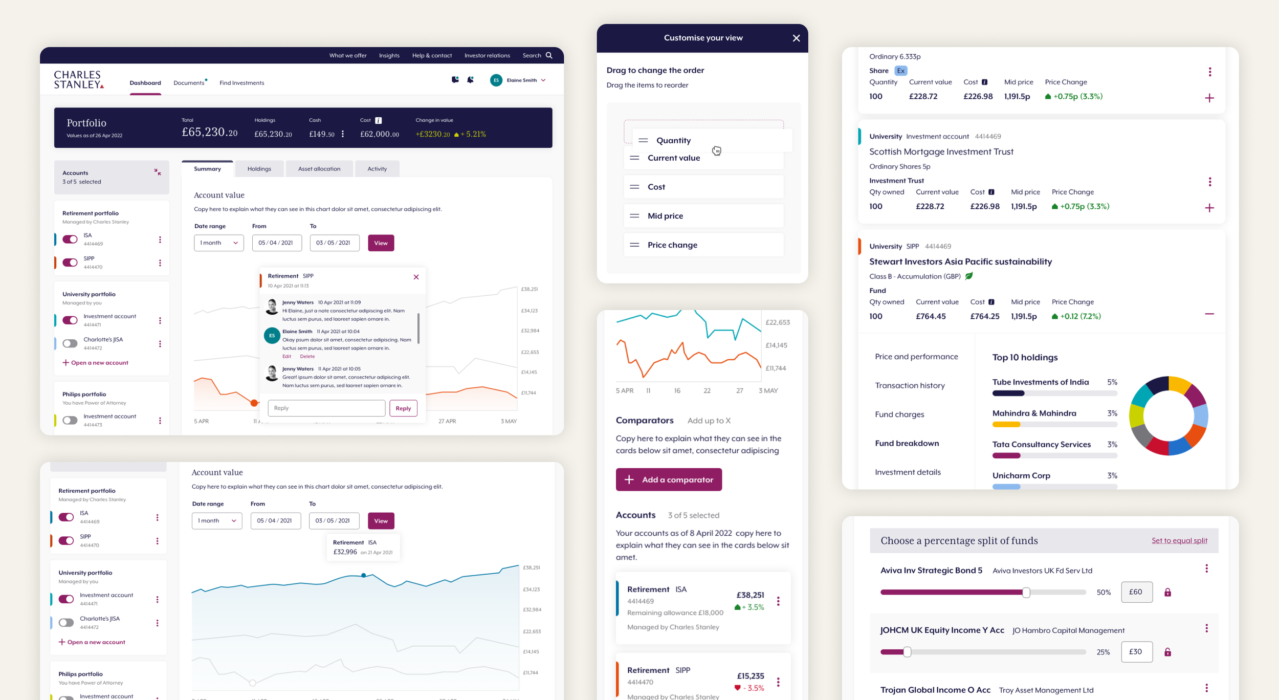
The richness of the logged-in experience is simplified for task-focused users, the logged-in interface prioritises functionality while maintaining visual consistency with the public site. Features like portfolio X-ray, trading, and account management are designed with clarity and ease of use in mind.
Creating the foundations for scale
After validating the new design direction through testing, I led the creation of a comprehensive design system that would support all of Charles Stanley’s digital products moving forward. This new system not only aligned with the brand’s identity but also laid the foundation for future digital growth, providing scalability for new features and services.


The impact
The work gave Charles Stanley a more coherent digital experience across its public website and logged-in services, alongside a scalable design foundation that could evolve with the organisation.
Next client story:
A Streaming Platform with a Difference
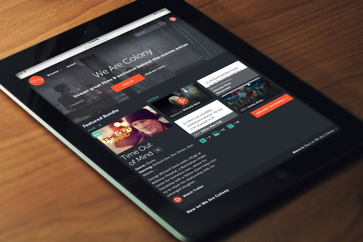
I helped take We Are Colony from ambitious start-up idea to award-winning streaming platform, shaping the product from the ground up and creating an experience that gave film lovers a new way to discover, watch and explore independent cinema.